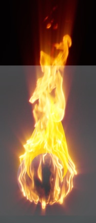
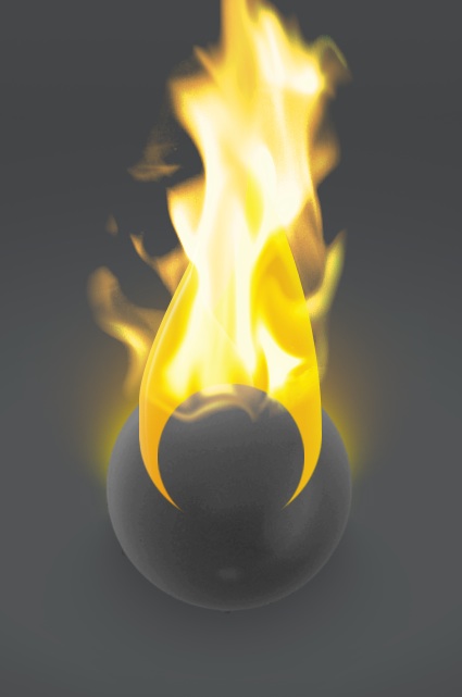
With the idea of fire now in mind, I started searching for stock video that could help me set this ball on fire. I found a perfect clip of an actual ball on fire. It fit perfectly and achieved the desired effect. It would still need tweaking to animate right and loop though. But it will need some tweaking to get it just right still
:-)
I just found stock video of a ball on fire! perfect!
Having to use Shake to crop movies! for gods sake!
WTF, the file actually contains no data, so It's more like, 0
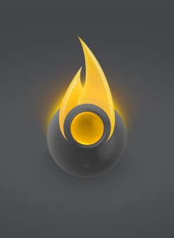

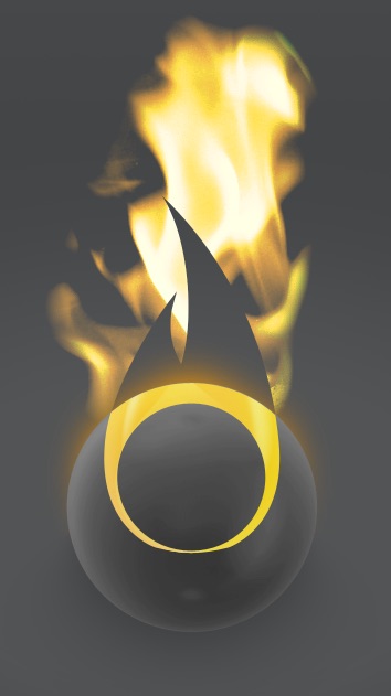
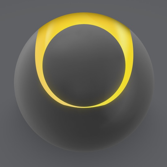
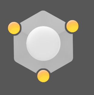
After removing the cube, I realized what I liked most about the fire illustration was the two resulting prongs within the sphere. With some adjustments, The result is a graphic that shows a circle within a circle.
just finished a comp in After Effects
I've had to bring in some other videos of fire, animate them sizing/moving in to make it look like the ball combusts
Also applying glows and shimmer etc

That is the result in Flash, comes to 128k
Now I can use it as a screensaver on my site!
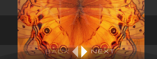
Working on Back, Next navigation in fullview. Added glows, and an eliptical backdrop to help visibility.
It's been a bigger pain than I had anticipated to get the graphics looking as I intended within Flash. Due to It's dynamic nature, the site may be drawn at any ratio or size, and designing for that is difficult. And coding for that, doubly so, my mind doesn't work very well with ratios and percentages and this work is absolutely loaded with them. After much struggle with relative positioning and scaling I have the graphics in line with my designed intention. And running at a pretty good speed after optimizations. Though the site still looks pretty stupid during intro on large display. Keeping a visual balance is so hard with dynamic layout
I've been tweaking the progress bars, the fullview progress bar now has a nice animation when fading in and out, taking advantage of Flashes new blur filter.
Status text shrunk and repositioned below ring.
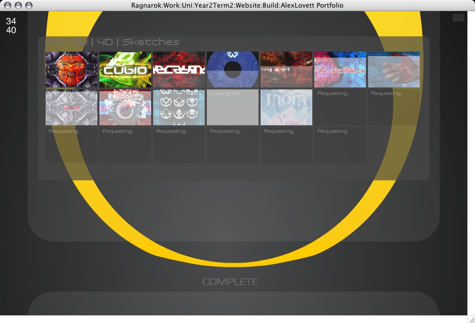
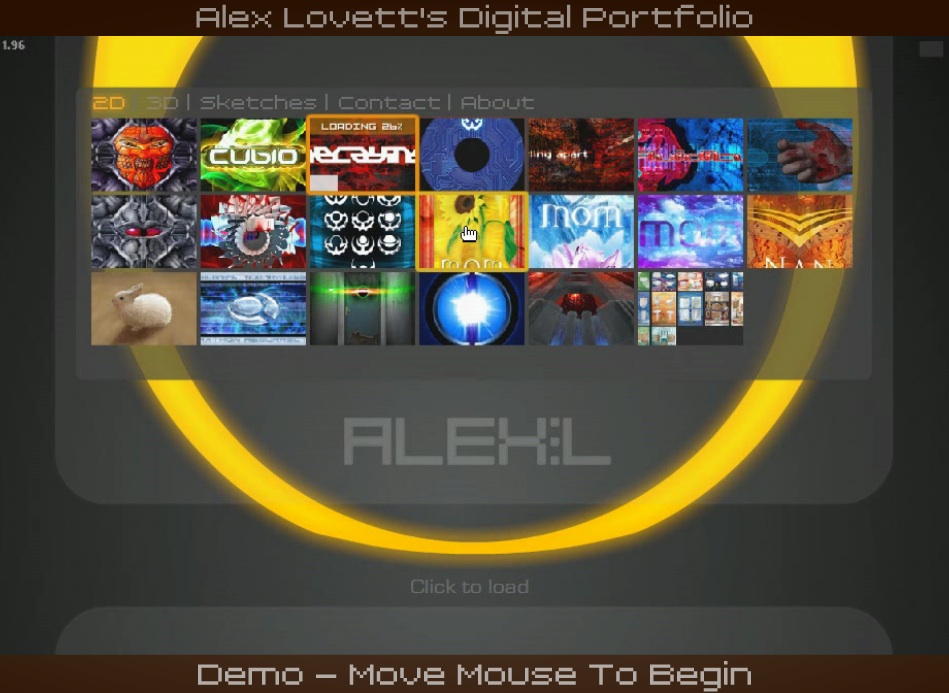
Below a shot of it loading thumbnails into the grid.
The thumbnail highlights/rollovers are not as spiffy as I'd like. I can't do them as I had designed due to... complexities involved with layering.
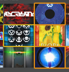
Darker orange denotes it has been loaded and viewed, yellow outline denotes it is under the mouse cursor and can be clicked.

Added section rollover highlights

Added an intro and exit animation on the close button tooltip. It's only subtle and short, but that's how I like it.
Fixed a faint button in the top right of the stage, that when clicked toggles stats on and off
These help while debugging the site, especially when ran from a browser which has no trace window. It also turns on the FPS meter which Is important when optimizing the speed.
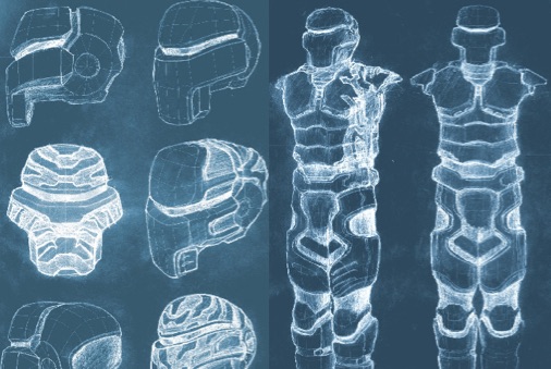
Would like to add inner views to all the sketches, I have the idea of simply fading between an inverted version of the same image, because that actually makes sketches look pretty weird and x-ray. But I want to do that in code, not with physically making inverted duplicates, would take forever. I've physically done it with a couple of sketches:
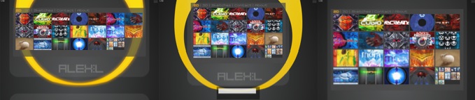
About Page
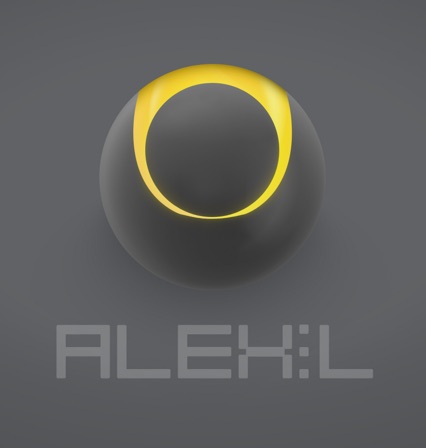
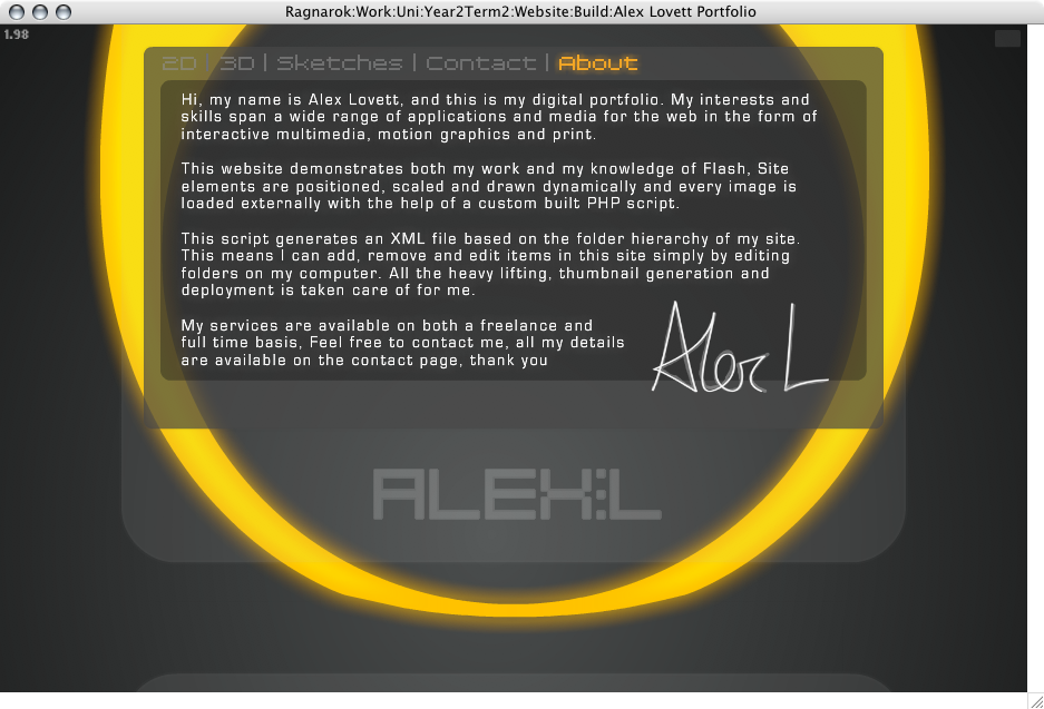
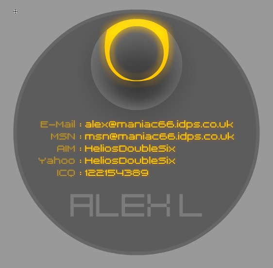
I have finally added my own name to my own site! ALEX:L Next I start work on adding an About page, this is to give a brief outline of what I do, what's special about this site, and that I'm available for hire.
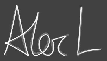
I had the idea to use my signature to personalize it more, I signed my name using my tablet and then traced over it with the pen tool in Photoshop, the tablet drawn signature is faintly underlaid.
I've added an odd new behavior to the site, which is well.. It's cool and semi useful while also showing off that the site really is dynamic. I was hoping to create some nice graphics and animation for the 'inner view' of the website. But there's just not been time to clean up that concept or think about implementing it. So instead I have tied a few parameters to the duality slider such as width and height restrictions on the boxel and, well It's easier to just use it and see. When dragging left and right while looking at the site (not fullview) the site re arranges itself so that the thumbnails take up the full stage size and pushes my name off the bottom and hides the ring graphic. I think It's cool, What I want to do is have some kind of visual or interaction take place wherever you are when you use the duality slider, so the user knows it does something.
Below is it in 3 stages, normal, part way, and full.
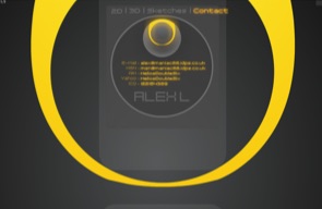
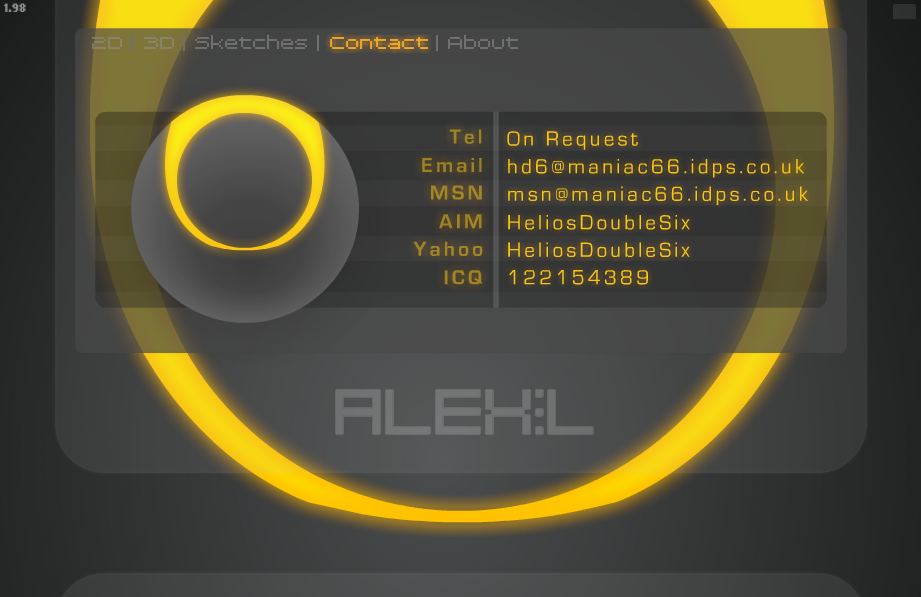
Contact Page
Working on adding a Contact page to the site:
First idea to use concentric circles again. This design might make for an interesting business card that's round and not square, though It's difficult to get readable text into this size.
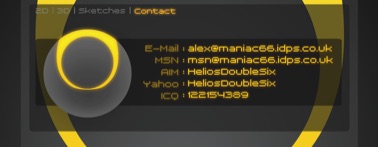
you can see that it is drawing it quite small, I'm limited in my vertical height,
my layout prefers more landscape orientated pages and so I set about redesigning it.
The second version fits the layout much better:
And now the design further refined below, change of type face and other subtleties. Made the ring animate a little glow
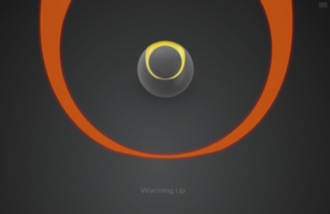
Screensaver
I have now implemented a screen saver function, as I am presenting this as a kiosk, I want it to be displaying things while people are not interacting with it. And so the portfolio detects when it has been inactive for a set period, and then displays a screen showing a video of the site being used with text explaining it is a demo:
As soon as the mouse is moved the site resets and starts loading from the beginning. You can press 'R' to reset to portfolio at any time. It was actually really hard to do that simple task. To reset the site to the very beginning, without actually re opening it. Because it loads so many variables and files which have to be cleaned out. In order to do this I had to create a new container that loads the site within it.
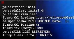
So now the site loads a Launcher.swf which is very small size, that file detects where the file is being played from in order to load data from the correct location (eg if It's loading from a CD or my website or some other exception) and then loads the loader.swf, the loader.swf loads the console, tracer, duality and fullview, and then the console loads the gallery, so lots of modules, but now they function pretty well independently.
In order to record a movie of myself using the site, I set the Flash FPS settings to 10fps and then recorded the screen at 10fps later speeding up the recording so it appears like normal speed, this was so that it ran super smooth and negated any impact on CPU the screen grabbing process was taking.
All sorts of problems have been encountered every step of the way with this project, simple things like loading an external .FLV and looping it, seem so simple on the surface, but require a lot of digging in manuals and fiddling to get round the many awkward security restriction flash now imposes. But I'm learning!
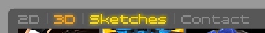
and I've added some code and animation to handle changing colour to show what current section the user is in. Orange is current section, Yellow is rollover. This helps the user understand where they are, and should make the navigation more apparent now it has a glowing orange bit lit up.
Final Shots
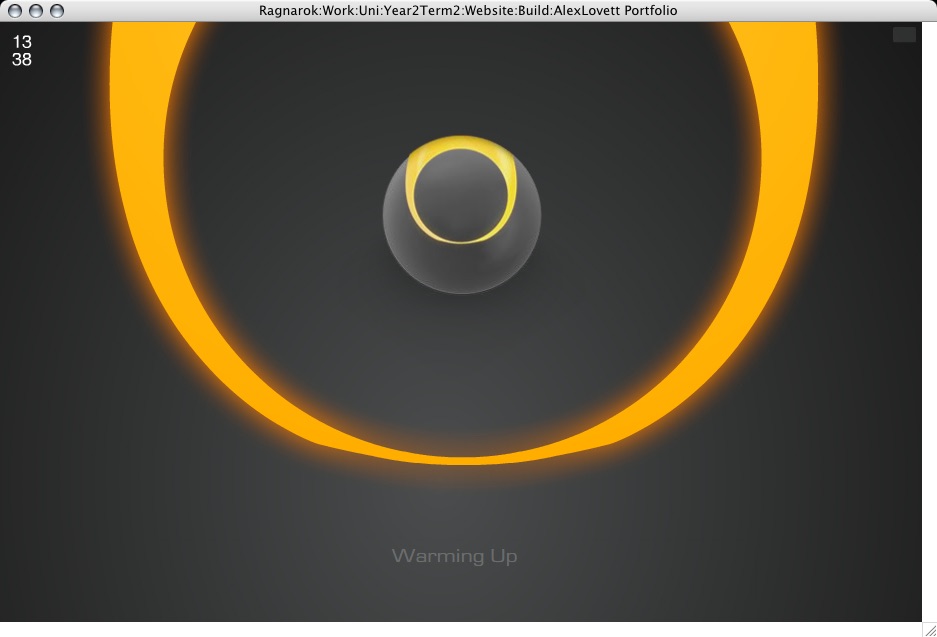
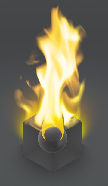
The ring fades thru Red, orange and yellow like It's heating up. And then he ball bursts into flames.
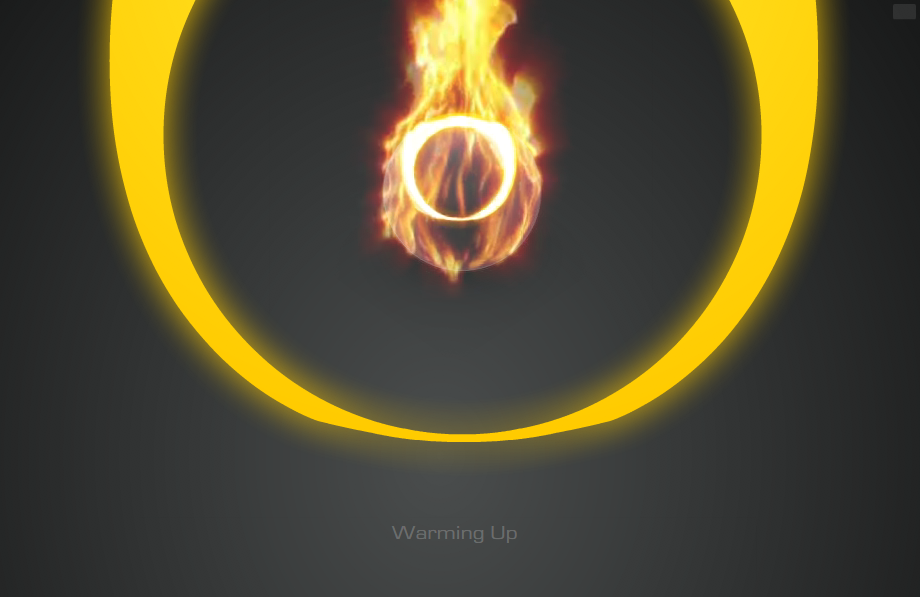
then he ball bursts into flames.
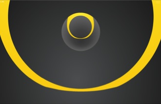
The Ring zooms into view, likes It's revealing an inner self.
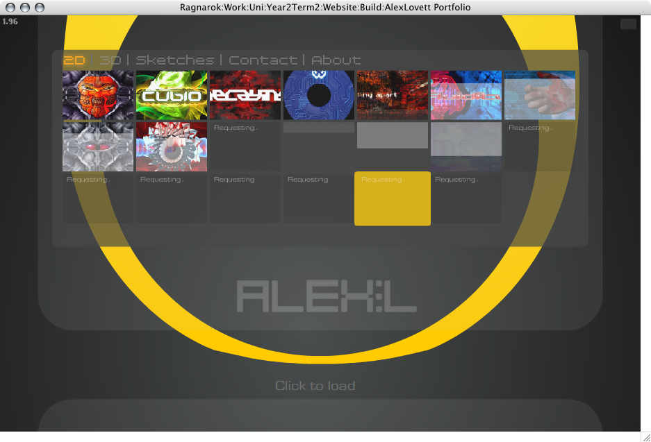
Thumbnails start loading. Grey faint squares represent the progress and look cool then the thumbnail fades in.
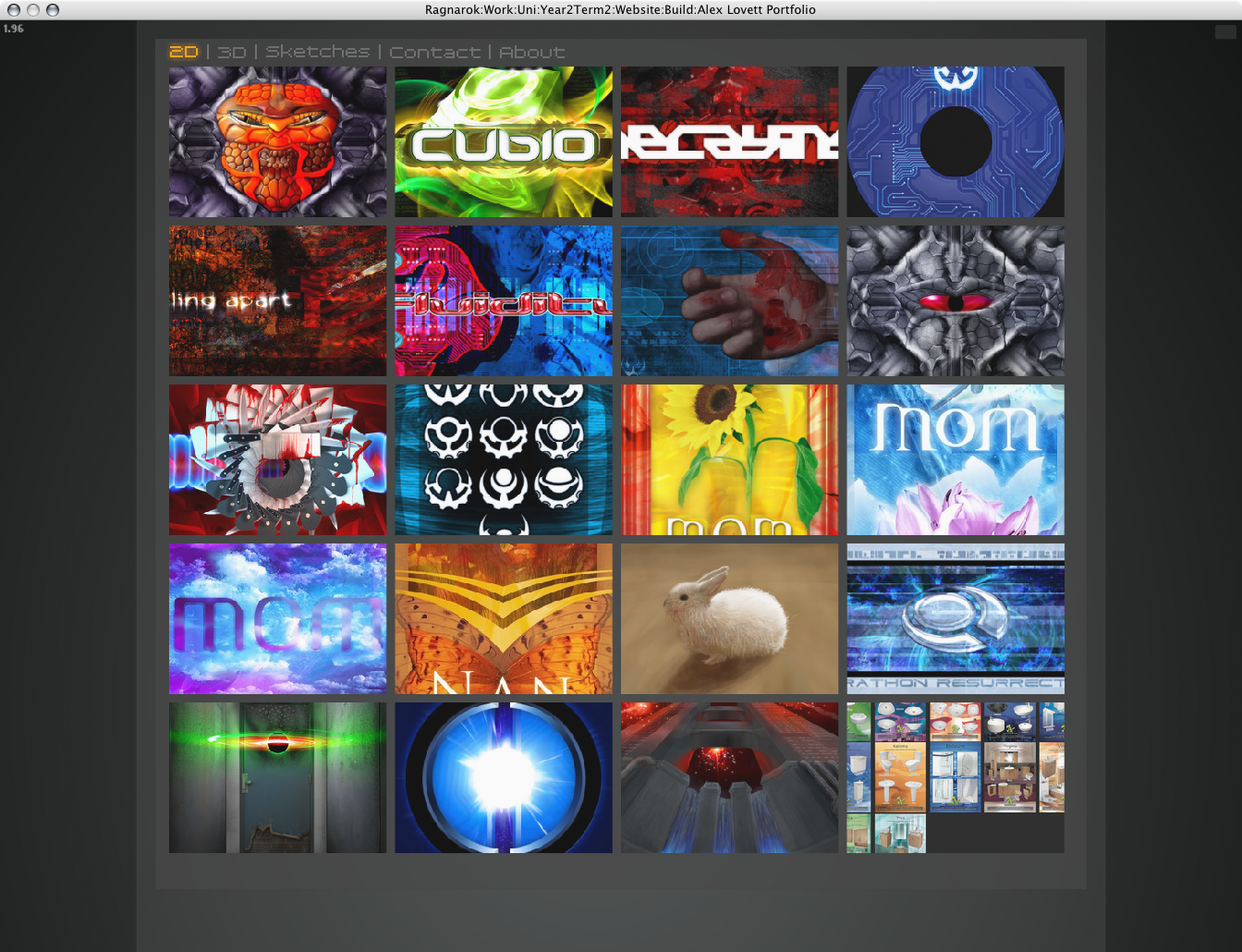
An enlarged view of how my site looks on a larger screen, higher quality thumbnails load in place.
Trying out shapes and arrangements around the theme of circles.
Keeping the sketches I have done in my head as inspirations.
The concepts of inner and outer, circles, and various imagery I have been playing with.
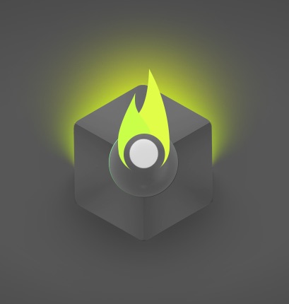
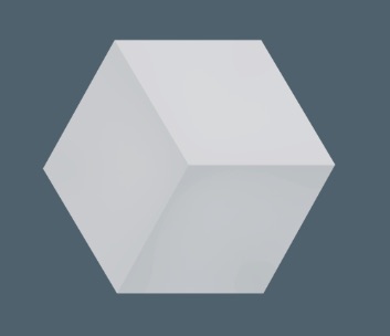
I started playing with glows and ended up trying out a fire effect which got me thinking about a potentially dramatic use of fire in the ident. Also I want to represent all the facets of what I do, 2D, 3D and Animation. So the cube is 3D, the circle is 2D and the fire is animated.
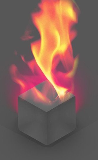
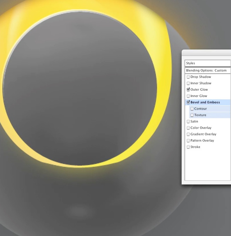
I tried representing the fire with an illustration. And then decided to remove the cube entirely leaving just the ball and the fire.

Development included as: 'Logo2.mov'

*rubs eyes* I'm awake, lets see if we can have a good solid day with stuff in the right order.
My Logo design concepts and work for my own logo:

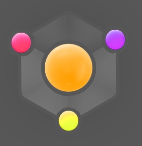
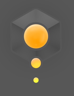
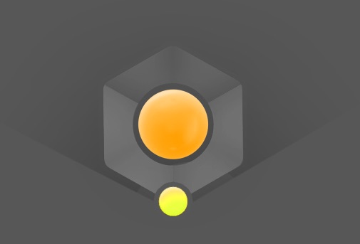
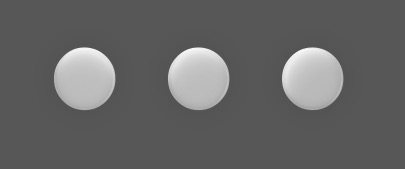
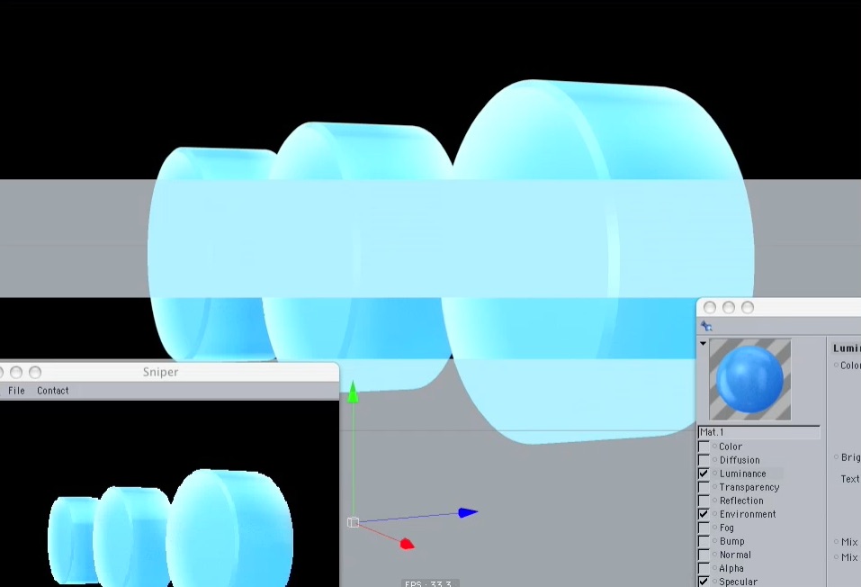
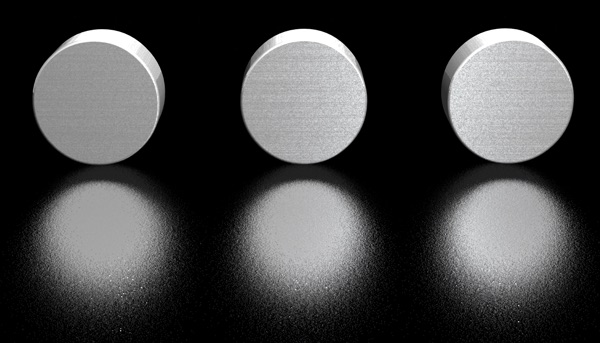
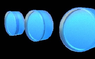
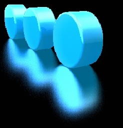
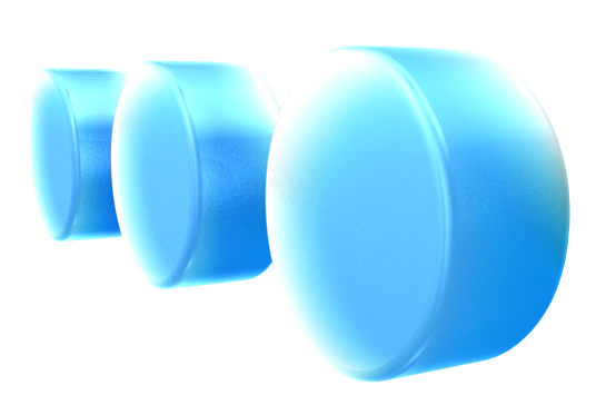
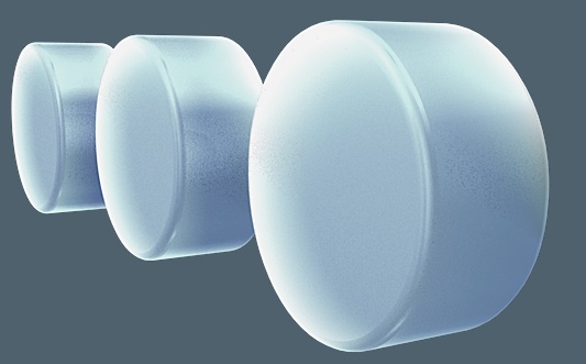
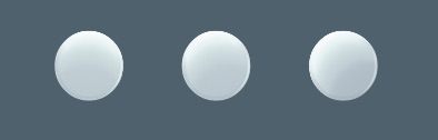
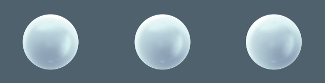
My explorations into using 3 circles but in a 3d dimensional form. Playing with potential textures/materials I could use.
Development included as: 'Logo1.mov'

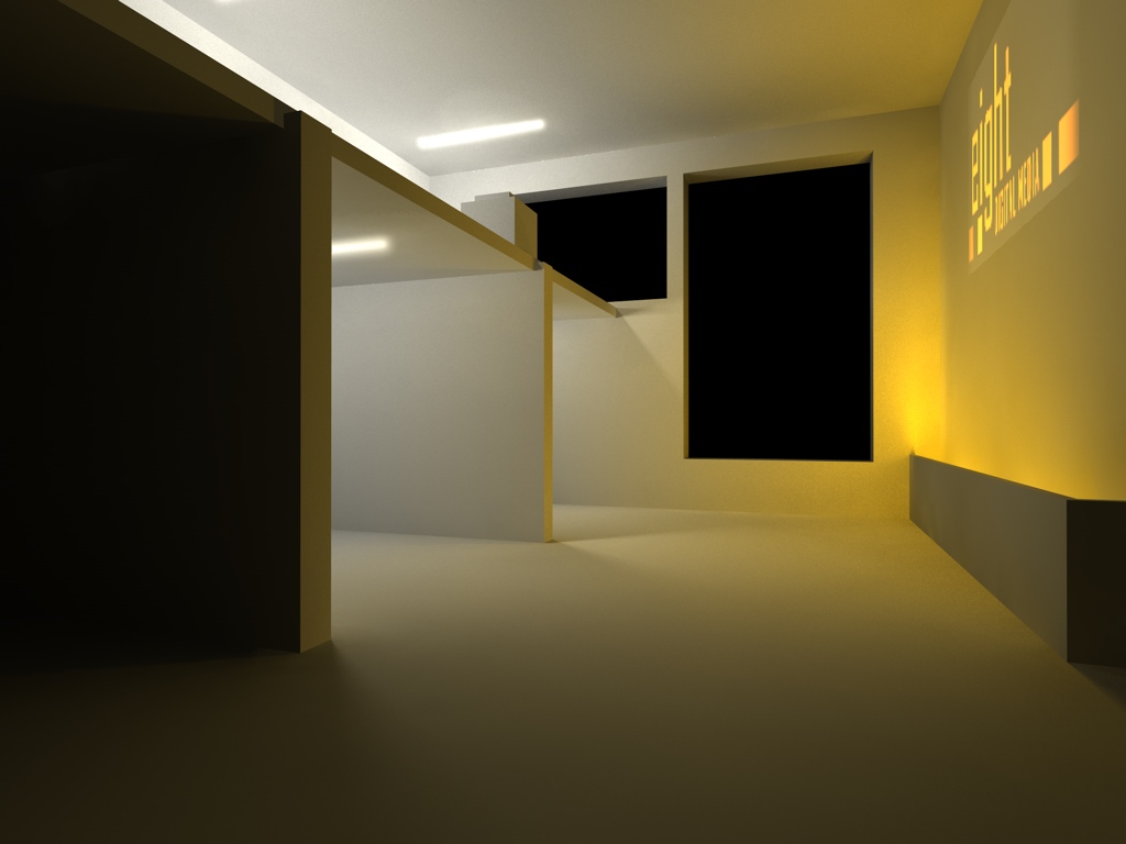
This is a piece of concept work for how we could use one of the rooms at green lane, blacking out the windows.
These are some concepts regarding the theme of 8 we chose to represent that there are 8 of us on the course. None of these ideas ended up being part of what we now have as a show ident.

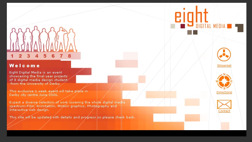
I designed and created the show website under guidance of the group.
The show reel should also be available on that site, It's not very exciting, just does It's job.

