wow
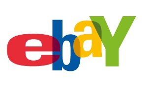
looks like ebay changed It's logo
amazing
its not often companies are this bold
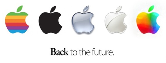
Old:
New:
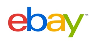
They say it 'reflects a dynamic future' whatever the fuck that means
-_-
it feels so boutique now
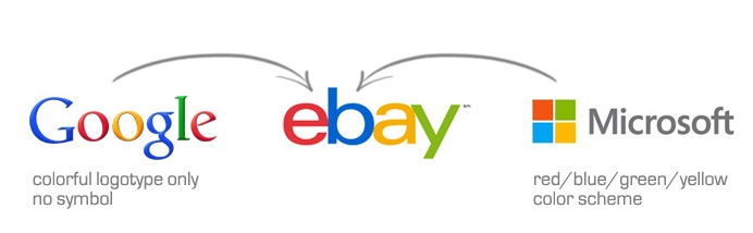
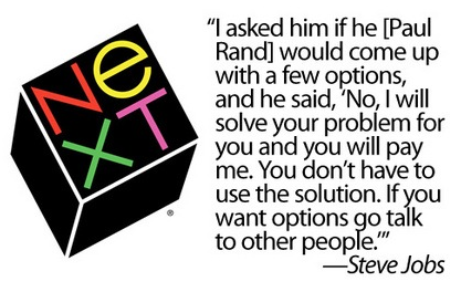
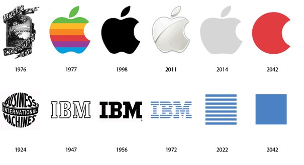
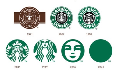
creative use of color again also, reminds me of past masters in logo design:

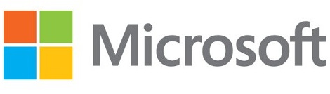
And MSFTS 'new' logo, inspired:
It's like a terribly boring conspiracy, the year of the ANTI logo
I still love how deftly MSFT joined the f and the t, it really changes it from just a bunch of letters taken directly from a boring font, and turns it into a work of art, week labouring over the exact shade of grey to infuse the type with.
At least google has a good excuse for having a shit logo, it was free
-
Lol looks like I'm not alone in making this granted rather obvious connection:
*starts to hyperventilate* *breaks glass and takes an emergency look at the one true logo, one to rule them all*
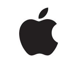
Yah I'm a fan boi, what evs
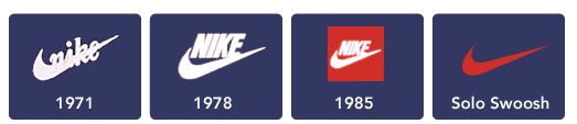
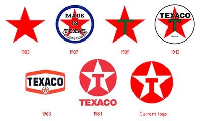
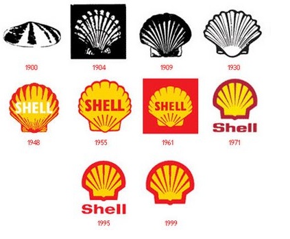
Here are some other logo's getter better:

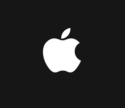
And best logo ever:
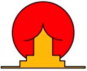
What did you see, I saw a temple in front of a big red sun....
It is always darkest, just before it goes pitch black, so only shadows comfort me
Got Unity tracing to Terminal.app in ANSI Color, and with stack tracing if needed wool


And Syntax colour for MonoDevelop, bit pink but what the hell, based on Xcode but Dark

Finally Photoshop has a Dark UI! Rejoyce!
Got Unity tracing to Terminal.app in ANSI Color, and with stack tracing if needed wool
And Syntax colour for MonoDevelop, bit pink but what the hell, based on Xcode but Dark
Finally Photoshop has a Dark UI! Rejoyce!